Menu
Brand visualisation & logo identity
Lily Valley
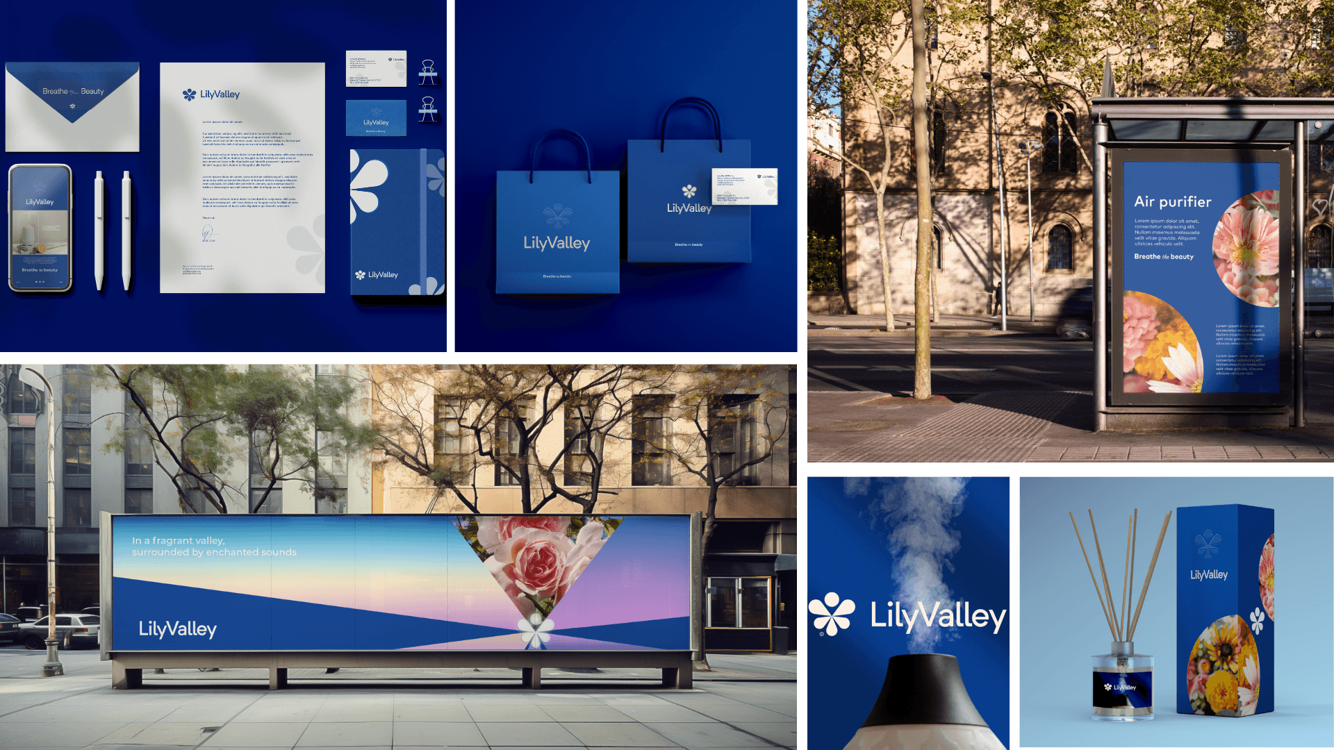
Lily Valley is a hypothetical company specialising in perfumes & air fresheners. Their mission is to become the paragon of luxury & refinement in the industry.
Lily Valley is a hypothetical company specialising in perfumes & air fresheners. Their mission is to become the paragon of luxury & refinement in the industry.
Concept
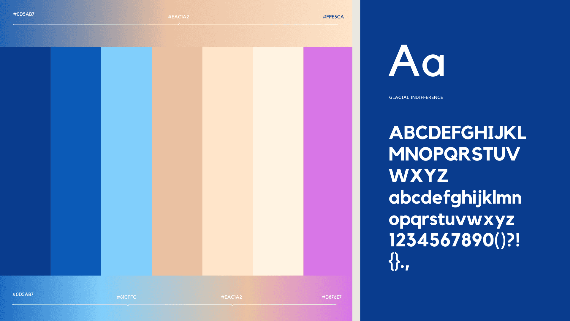
The logo was professionally designed to meet the company's needs and, most importantly, to appeal to its target audience. embodying the concepts of luxury and sophistication intrinsic to the brand.
The logo's design was inspired by several elements, each symbolizing the scent and the feeling associated with the brand. The golden ratio was applied to the logo to imbue it with the sense of balance and precision inherent in the brand's work.
Insights
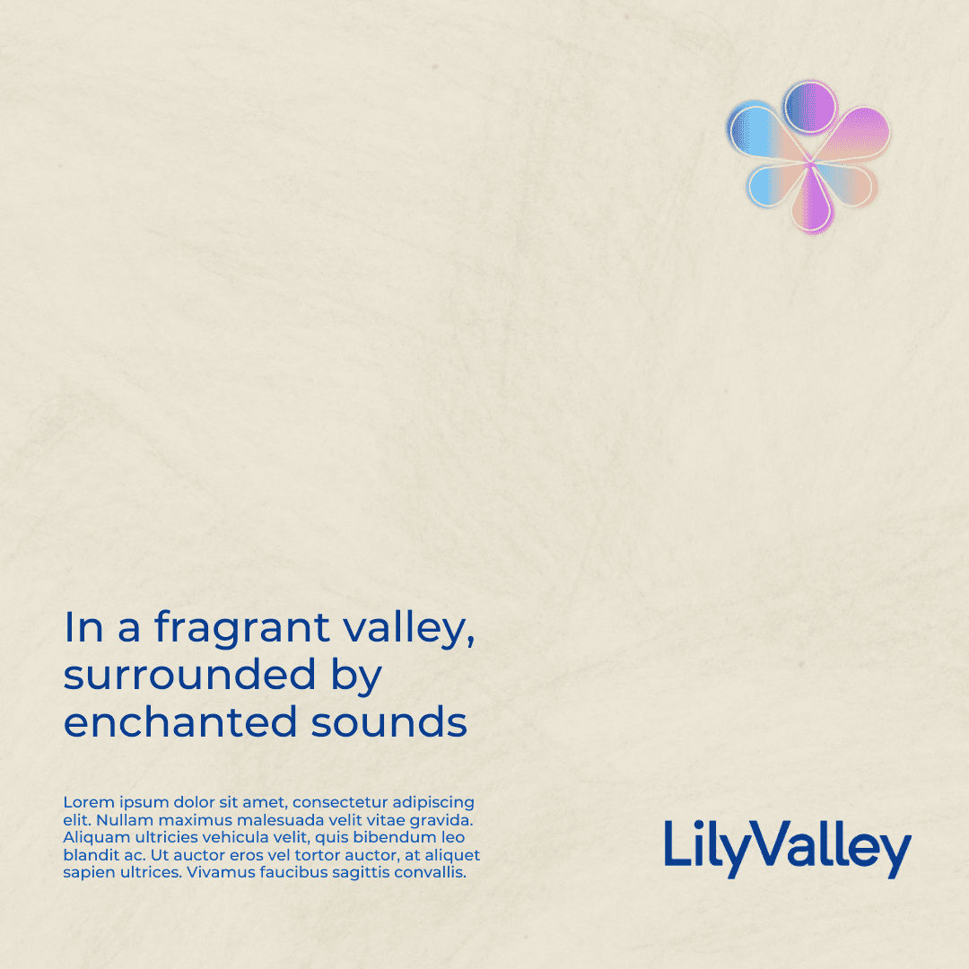
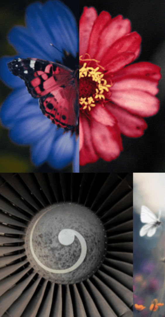
When designing the logo, the shape of the butterfly was taken into account for several reasons. It symbolizes both portability and elegance, and it is often found in the most prosperous and beautiful places, particularly among flowers.
Speaking of flowers, this brings us to the company's name. Lily. The logo embodies this name by combining the shape of a butterfly with the form of a lily flower.
Concept
The logo was professionally designed to meet the company's needs and, most importantly, to appeal to its target audience. embodying the concepts of luxury and sophistication intrinsic to the brand.
The logo's design was inspired by several elements, each symbolizing the scent and the feeling associated with the brand. The golden ratio was applied to the logo to imbue it with the sense of balance and precision inherent in the brand's work.
Insights
When designing the logo, the shape of the butterfly was taken into account for several reasons. It symbolizes both portability and elegance, and it is often found in the most prosperous and beautiful places, particularly among flowers.
Speaking of flowers, this brings us to the company's name. Lily. The logo embodies this name by combining the shape of a butterfly with the form of a lily flower.